| Population density | 2003-03-08 23:41 4 comments |
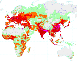
 by Flemming Funch by Flemming FunchHere is a map of the population density on Earth. I like maps like that. I notice there's tons of space with nobody there. Because we've already turned those places into deserts mostly. And some places with a huge concentration of people. Mikel Maron says: " It would be so cool to see this animated, over time. Watch the population explode and recede, like colored waves of bacteria, over centuries. This would work well for other data sets -- like the spread of memes over the world. This is something I'm tooling with -- weblogs.com + ICBM + RSS + Flash!"Yes, that would be very cool. There are lots of things I'd love to see in near real-time on a map, or a globe. I'd like to be able to play with different data sets. Resource use, money flows, health, education, net traffic, the people I know, etc. |